
top of page

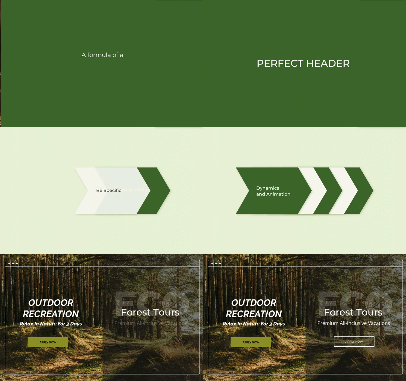
A formula of a perfect header

  • Writer: Anna from LightTECH
    Anna from LightTECH
  • Mar 19
  • 2 min read

Updated: Apr 14

Your website’s header is the first decision point. On the main screen or inside advertising blocks, it determines in seconds whether a visitor stays or leaves. A strong header doesn’t just look attractive — it communicates value instantly, captures attention, and directs users toward action.


But in 2026, writing a good headline is only half the equation. The real impact comes from combining persuasive structure with smart visual dynamics.


1. Make It Useful

The first question any visitor asks is: “What’s in it for me?” Your header must provide a clear answer. Generic phrases like “Welcome to Our Site” or “Our Services” go unnoticed by busy users. Instead, focus on user benefits:


  • “Increase Online Sales by 30% in 30 Days”

  • “Save 10 Hours a Week with Smart Automation”


On the main screen and in ad blocks, this type of header immediately shows visitors why they should stay and explore your site.


2. Be Specific

Specific details build trust. Numbers, timelines, and measurable outcomes make a header more credible and memorable.


  • Weak: “Improve Your Marketing”

  • Strong: “Increase Email Open Rates by 45% in 2 Weeks”


Specific headers reduce doubt and give users a clear picture of results. On the main screen, specificity sets expectations. In ad blocks, it motivates clicks.


3. Highlight Uniqueness

Your header should set you apart from competitors. Even a strong benefit loses impact if it sounds like everyone else’s.


Uniqueness can come from:

  • a new method or approach

  • targeting a specific audience

  • an unusual combination of benefits


Example: “For Designers Who Hate Templates — Personal UI Tools Inside”

Example: “The Only CRM That Auto-Segments Leads by Behavior”


On landing pages, unique headers spark curiosity. On ad blocks, they stop users scrolling.


4. Create Urgency

Urgency prompts action. Even a clear benefit may be ignored if there’s no reason to act immediately.


Ways to create urgency:

  • limited-time offers

  • seasonal promotions

  • exclusive access

  • scarcity


Example: “Sign Up Today — Only 50 Free Accounts Left”

Example: “Get Lifetime Access Before Prices Increase Next Week”


For ad blocks, urgency increases clicks. On the main screen, it encourages users to explore or start immediately.


5. Dynamics, Animation, and Micro-Interactions

Now here’s what has changed. A static headline competes in a world of motion. Users scroll quickly. Visual fatigue is real. Attention is fragile.That’s why modern header design integrates movement with meaning.


Animation, when used strategically, can:

  • direct focus to key words

  • reveal information step-by-step

  • increase time spent on the screen

  • reinforce hierarchy

  • create emotional engagement


The key principle is motion should clarify, not distract. When animation supports the message — not competes with it — conversions improve.


Creating persuasive headlines is already a challenge. Adding dynamic behavior, testing variations, and keeping consistency across main screens and advertising blocks makes it even more complex.


That’s where Text Slide Builder becomes a practical solution.

Text Slide Builder allows you to create structured, animated headline sequences without heavy development. You can rotate value propositions, test messaging variations, add smooth transitions, and control how your main screen communicates with visitors. Instead of static text, you build dynamic header systems that adapt to user attention and increase engagement. Because today, a header isn’t just a sentence at the top of a page. It’s a conversion mechanism.


Recommended by Light-tech

bottom of page